Dona Rita
A mobile food delivery app featuring traditional Brazilian snacks and treats. Browse menus, customize orders, and track delivery with an intuitive and friendly interface.

Project Overview
Ordering food delivery can be complicated with confusing menus, difficult checkout processes, and unclear order tracking. Many apps overwhelm users with too many options and complex navigation.
Dona Rita simplifies food delivery with a clean, intuitive interface focused on Brazilian comfort food. The app makes browsing, ordering, and tracking simple for users of all ages.
The Challenge
Users struggle with complicated food delivery apps that have cluttered menus, confusing checkout flows, and poor order tracking systems.
How might we create a food delivery experience that's simple, fast, and delightful for users ordering traditional Brazilian food?
Research Insights
To understand user needs, I analyzed existing delivery apps and talked to people who frequently order food online.
Methods:
- Informal interviews with frequent food delivery users
- Analysis of existing delivery apps (iFood, Uber Eats, Rappi)
- Read user reviews about delivery app pain points
Key insights:
- Users want quick browsing without information overload
- Cart management needs to be simple with clear quantity controls
- Checkout process should be fast with minimal steps
- Order tracking must be clear and easy to find
- Visual food images significantly influence purchase decisions
These findings shaped Dona Rita's focus on simplicity, clear visual hierarchy, and streamlined user flows.
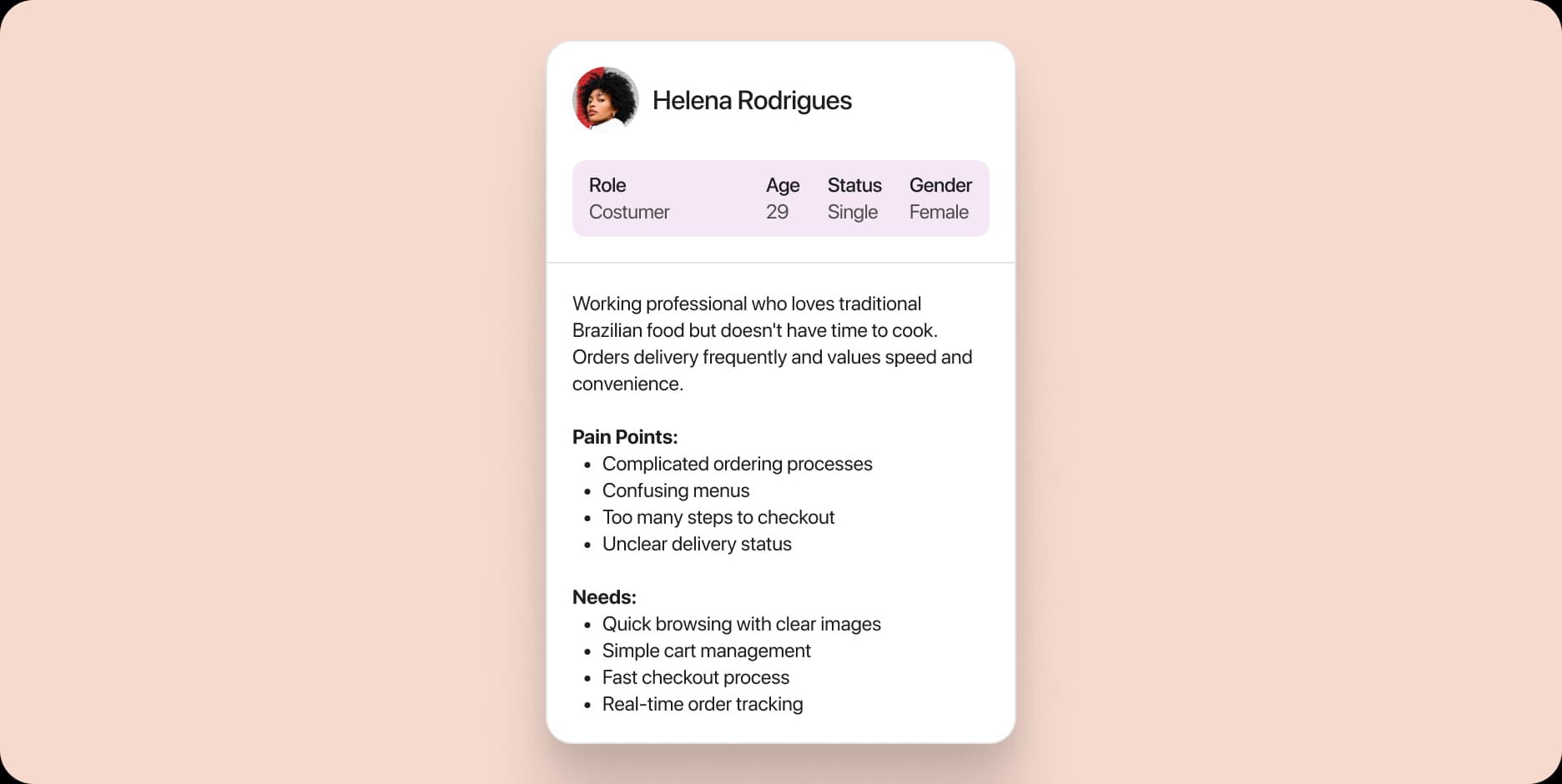
User Personas
To build a realistic and user-centered solution, I created a persona representing the primary user: customers ordering traditional Brazilian food through the app.
Design Process
I planned the app structure focusing on making the ordering process as simple as possible.
Key Decisions:
- Bottom tab navigation (Home, Menu, Cart, Profile)
- Large food images for easy browsing
- Simple quantity controls with +/- buttons
- One-page cart view with clear total
Main Iterations:
- Added category filters at the top for quick browsing
- Implemented floating cart button showing current total
- Created clear visual feedback when items are added
- Designed simple checkout with saved payment methods
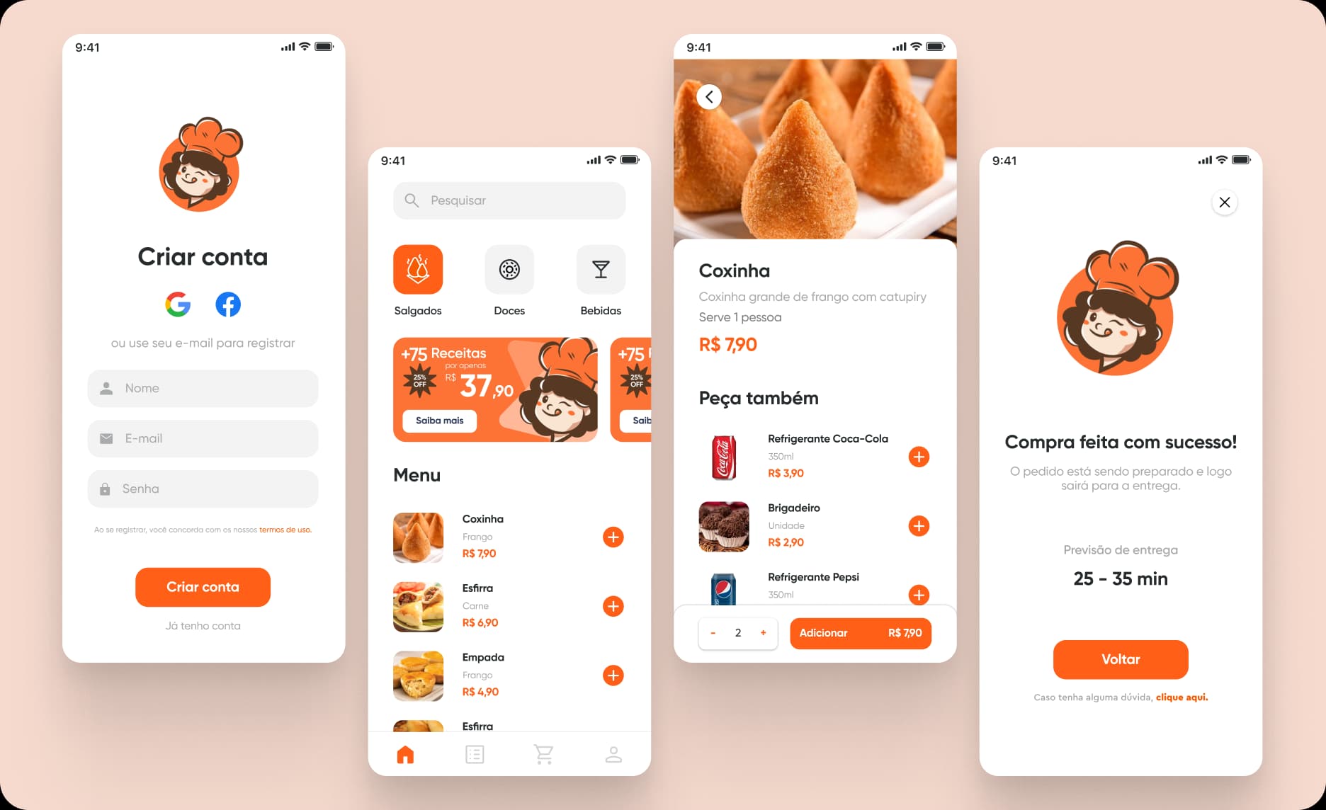
Main Navigation Screens
The app is organized around four main sections accessible through the bottom navigation bar, designed for quick access to essential functions.
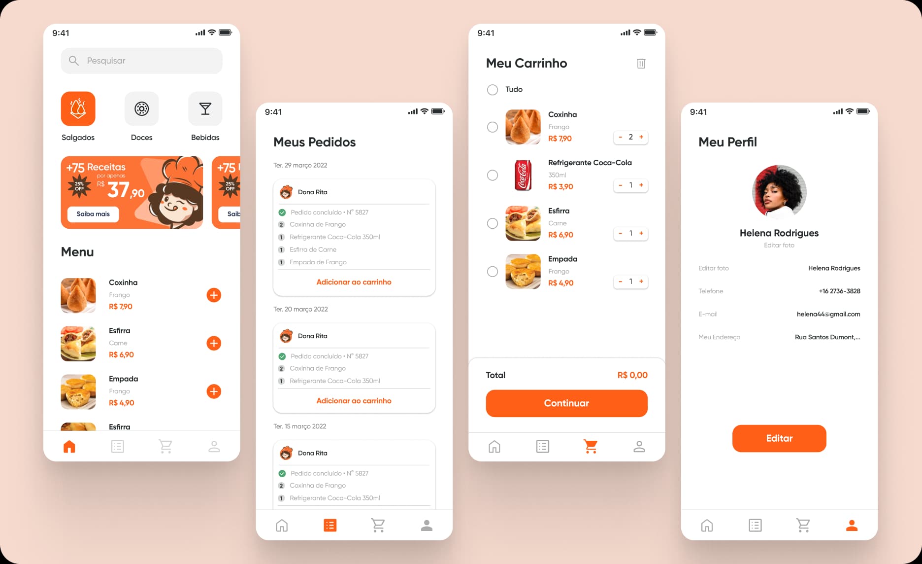
Home: Main landing screen with category filters (Salgados, Doces, Bebidas) for quick browsing. Features promotional banners with current offers and discounts. Complete menu displayed below with large product images, names, descriptions, and prices. Each item has an add (+) button for instant cart addition.
My Orders: Order history organized chronologically by date. Each order card shows Dona Rita's profile, order number, completion status, and full item list with quantities. Users can track past purchases and reorder favorite items easily.
Cart: Shopping cart displaying all selected items with product images, names, categories, and prices. Quantity controls (+/-) for each item with real-time total updates. 'Select All' option for bulk actions. Clear 'Continue' button at bottom shows final order value.
Profile: User account management showing profile photo, name (Helena Rodrigues), and contact information (phone, email, address). Edit button allows users to update personal details. Clean, simple layout with clear form fields.
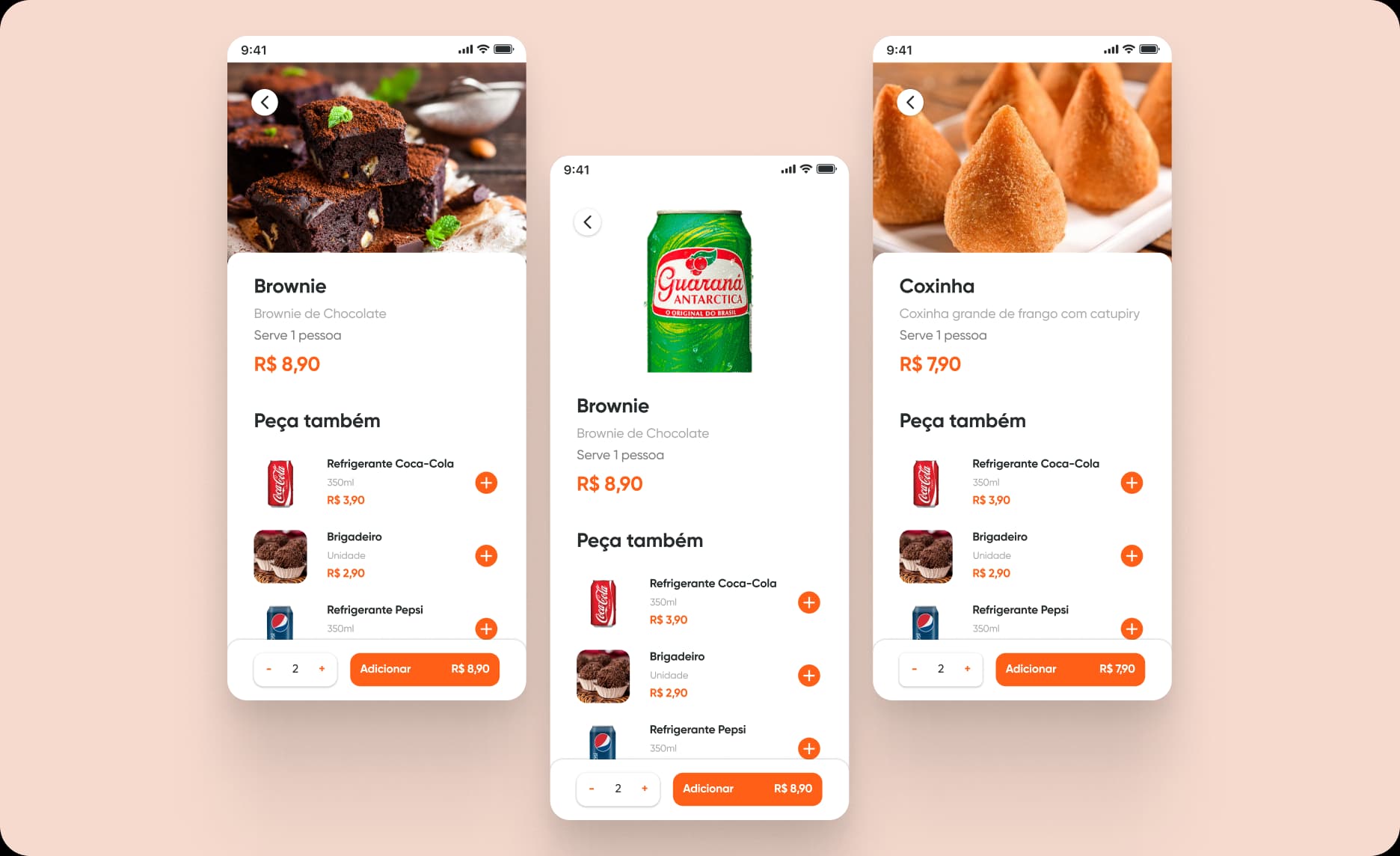
Product Detail
Full-screen product view with large hero image showing the item (Coxinha, Brownie, etc.). Includes detailed description, serving size, and price prominently displayed. Simple quantity selector with +/- controls and 'Add to Cart' button showing total price. 'You might also like' section at bottom suggests complementary items (drinks, other snacks).
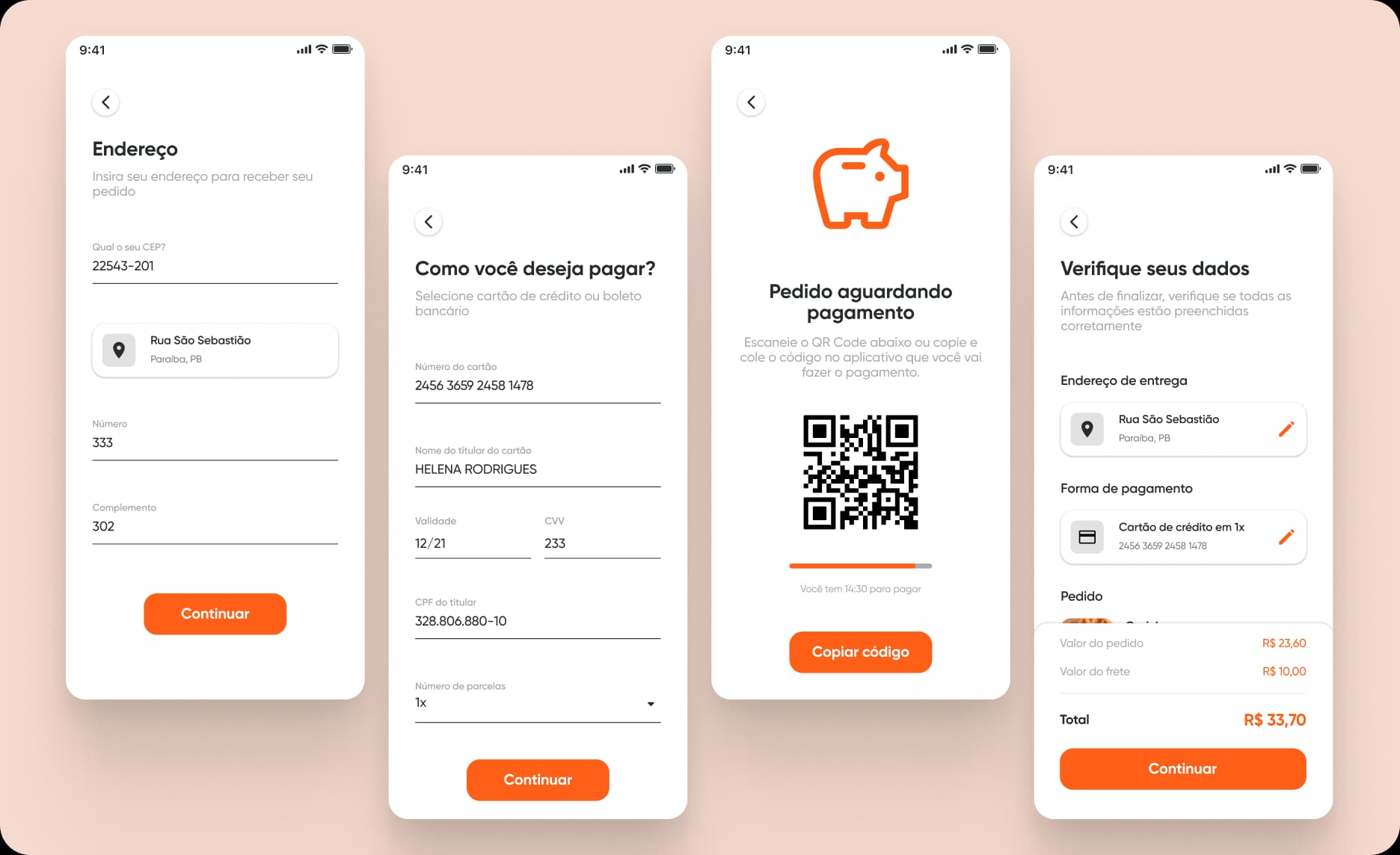
Checkout & Payment Flow
The app includes a streamlined checkout process from cart to delivery confirmation.
Address Entry: Simple form with fields for ZIP code, street address, number, and complement. Saved addresses available for quick selection. Clean layout with proper input formatting.
Payment Selection: Choose between credit card or bank slip (Pix). Credit card form includes all necessary fields (card number, cardholder name, expiration date, CVV, CPF) with clear labels and validation. Option to save card for future purchases.
Order Review: Verification screen titled 'Verifique seus dados' showing complete order summary. Displays delivery address with edit option, selected payment method, itemized cart with quantities and prices, subtotal, delivery fee, and final total. Large 'Continue' button to complete purchase.
Payment Processing: For Pix payments, displays QR code for scanning with payment instructions. Shows countdown timer (14:30 minutes) indicating payment deadline. Progress bar provides visual feedback on remaining time.
Order Confirmation: Success screen with friendly message 'Compra feita com sucesso!' (Purchase successful). Displays estimated delivery time (25-35 minutes) with clear iconography. 'Return' button to go back to home screen and link for support if needed.
Conclusion
Dona Rita demonstrates how simple, focused design can create a better food delivery experience. By prioritizing clear navigation, large food imagery, and streamlined checkout, the app makes ordering quick and enjoyable for users.